Wednesday, April 29, 2015
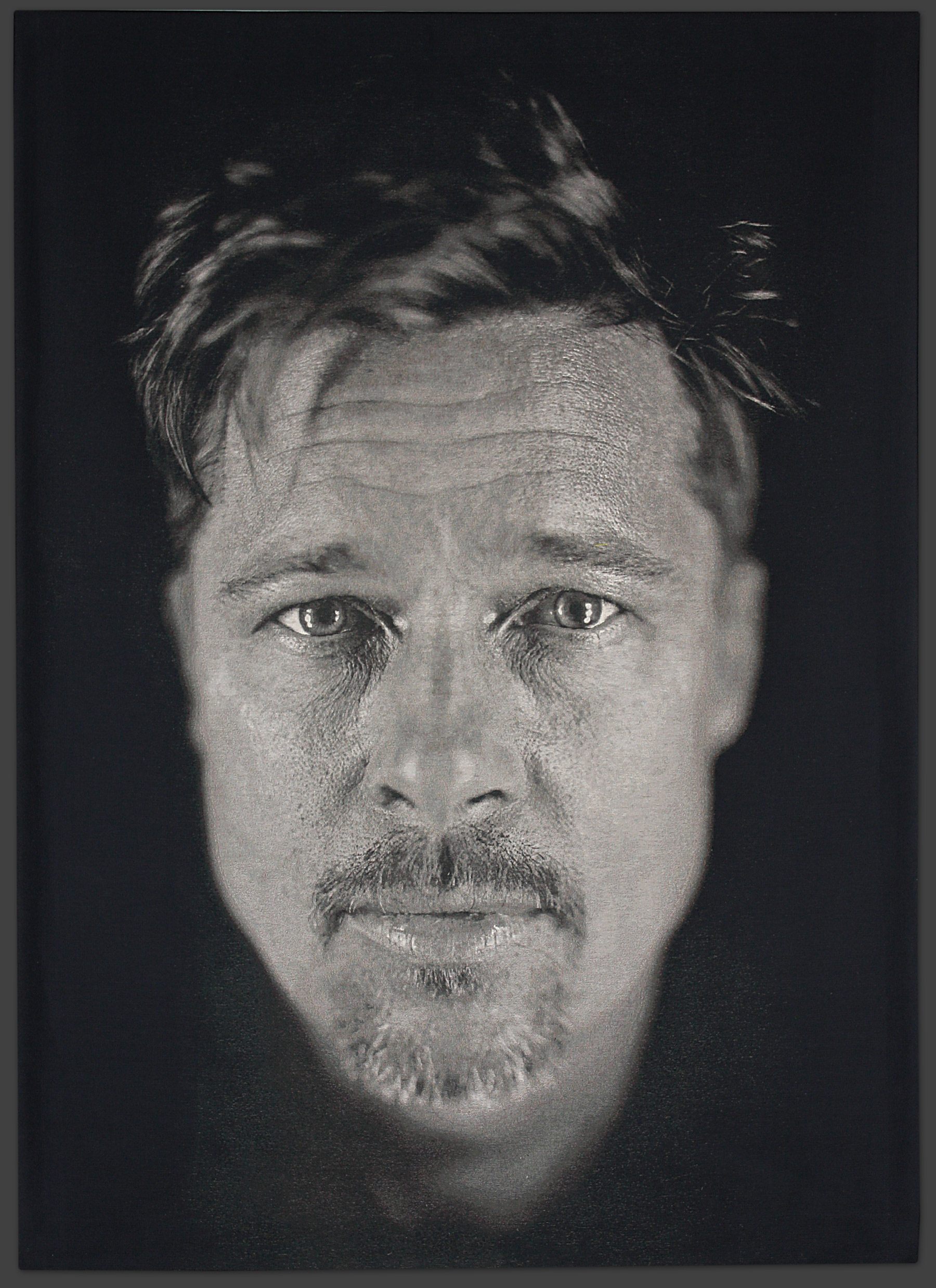
Brad

Chuck Close

Chuck Close
1985
This is actually a finger painting by Chuck Close. I admire these the most because i think its incredible how he adds so much detail to a painting by just using his fingers. I also like that it is in black and white, because i feel that it looks more authentic.
Lorna- Chuck Close

This work Lorna by Chuck Close looks so much like a black and white photo it's astounding. The medium is jacquard tapestry. Close completed this work in 2006. What really drew me to this piece was not only how real it looks, but also how the use of shading draws the viewers attention to the face. The face as well as the woman's expression is very detailed in nature, while the rest of her; the neck, chest area and hair, are blurred.
blog 12

I chose Emma by Chuck Close. When I was looking at a lot of his works this one stuck out to me because the baby looked very happy. The look on Emma's face is what drew me to this work of art. I think Close's style and talent is amazing, even through everything he has been through in his personal life he still creates phenomenal works of art.
Leslie

Chuck Close. Leslie/Watercolor. 1972.
Water color on paper canvas.
When I first looked at this painting, I thought it was a
photograph. It looks like it was taken from a camera, with a soft focus. The
detail of the woman’s face is amazing, the shadows, her hair, her eyelashes,
the lines on her lips are so precise. I was amazed to find that it is actually
a watercolor painting.
Chuck Close

I chose this painting, Lucas II because I really like his more colorful and painterly style. Here he is going beyond the hyper reality of his earlier works and elaborates on his interpretation of the act of perception. He's breaking down the visuals into different portions of colors. I especially like the circle background that he has created.
Emma-Chuck Close

I liked this chuck close the most out of the ones i saw, i like his use of colors that you can still see individual squares when you look closer but as a whole it is just a happy painting. This is a woodcut print based on a painting in Close's late signature style. Chuck spent three months on the painting; master printer Yasu Shibata spent two years carving 27 wodblocks to print 113 colors 132 times to make each print.
Chuck Close - Bill Clinton

*que presidential theme song*
President Bill Clinton
Chuck Close
2006
Oil on Canvas
I really enjoy observing this work in particular. The artist has chosen an extremely well known iconic person to portray in a different way. From a far, the viewer sees Bill Clinton with all of his facial expression, while up close, it is various individual designs. It is artwork within the artwork.... it is a work of art from all angles. I find his entire process of artwork to be very fascinating.
Kimberly Sanguinedo
Tuesday, April 28, 2015
Chuck Close Blog

Chuck Close
Bige Self-Portrait. 1967-'68
Acrylic on Canvas
1969
I chose this piece by Chuck Close because of its hyper realistic nature. I would have never known that it was a painting until I saw the hair on his head which is a little blurred but that could be confused as film imperfections on 35 mm. I am highly impressed with the level of detail, The portion we saw in the feature piece showed the detail of the hairs on his face and I was stunned by his attention to minutia, the equivalent to reaching perfect pitch. The reflection in his glasses is absolutely stunning and really is the main draw for me because of how hyper realistic it was. Hyper realism is the realistic painting to the extreme that happened at the end of the '60s against the '50s abstractionism, taking people and then turning them into cartoons which would happen a lot for pinups. The point of this hyper realism is a part of the "no brush-stroke" movement where there should be no trace of brush-strokes.
Chuck

I love this picture by chuck close. It is a piece that I have never seen before. I like how it is not like a usual chuck close painting. this piece titled Brad is a print and multiples piece. It looks so old and antique as if it is an old photo on a glass like from the 1700s.
Chuck Close
(American, born 1940)Brad,
2012
Price on Request
Chuck Close

Lucas II
Silk on linen
1993
Chuck Close
I chose this painting by Chuck close because I thought it was interesting contrast based on the grid work he usually does. This painting is different then his others because the squares for this work is not going horizontal or vertical ut are in a circle position. It gives the picture more depth and contrast based on the colors used for the face of his subject. Most of Close's work consisted of thousands of of square boxes that he would fill with multiple colors to compose skin tones, hair texture and background.
Monday, April 27, 2015
Final Slide Essay
How does Hollywood Films differ from the art films viewed and discussed at the midterm?
Discuss the mass appeal of Hollywood films compared to the limited or special appeal of fine art found in galleries and museums.
Should these Hollywood films be archived in the Museum of Modern Art? Explain




Thursday, April 23, 2015
Blog #11 Chuck Close- Phil

Emma, Chuck Close

Wednesday, April 22, 2015
Chuck Close- Mark

This painting was created by Chuck Close in 1978-1979. It is called Mark and is an acrylic on canvas. This painting shows an ordinary man in glasses. I like this painting because it is very life like. I chose this painting because I first thought that it looked like a photograph but then found out that it was a painting. I think that it is cool that you cannot really tell that it is a painting.
Link to Jenny gallery
http://www.gagosian.com/exhibitions/october-02-1999--jenny-saville/exhibition-images
For my senior project, I want to do a fleshy oil painting inspired by Jenny Saville. I love her disgusting yet beautiful technique she uses when painting. I also love her she takes unconventional beauty and makes it appealing. I posted a link, rather than a picture, because the link leads to a gallery of a few Jenny paintings. I'm not sure what painting I want to focus on, or if I want to focus on one at all.
For my senior project, I want to do a fleshy oil painting inspired by Jenny Saville. I love her disgusting yet beautiful technique she uses when painting. I also love her she takes unconventional beauty and makes it appealing. I posted a link, rather than a picture, because the link leads to a gallery of a few Jenny paintings. I'm not sure what painting I want to focus on, or if I want to focus on one at all.
Pablo Picasso

I found Pablo Picasso's use of cubism inspiring and something that I would enjoy using for inspiration for the independent project. Not only do I find the use of bright and dark colors together, but the utilization of a variety of shapes to recreate an image I find intriguing. The use of such different colors and shapes to create a human face makes the image prone to different perceptions. When I look at the picture I see different things, and my eyes aren't always drawn to one singular area.
Magritte
.jpg!Blog.jpg)
Magritte
1934
I chose Magritte because he is my favorite surrealist. This is also one of my favorite paintings by him. I like how his work looks clean and simple, because thats the way I like my own work to be. He plays mind tricks with his paintings, and I want to be able to accomplish something similar with my independent project.
The Deep

The Deep by Jackson Pollock
Oil on Canvas
Jackson Pollock’s Drip Paintings became known to the world from 1940s and 1950s when his star was the brightest in his whole career. The American artist’s whole career was based on newly invented technique which is sometimes described as the blend of Abstract Expressionism, Surrealism and Cubism with his own Drip technique. This blend mostly created a beautiful creation which would get the viewer’s attention and get them instantly interpreting the work. Pollock’s popular work, No. 5, 1948 is a good example of it.
Subscribe to:
Posts (Atom)